
Bigeye is a data observability startup built to help companies make better business decisions with their data. I joined as the third design hire and first brand designer. Competing in a tight category and rapidly gaining market share and awareness, the Bigeye brand needed to evolve from its quick-fire beginnings into a lasting brand that could scale across all touchpoints.
Bigeye
Creative Director
November 2021 - Present
Work started with the foundations. I began by partnering with the Director of Product Marketing to better understand Bigeye's positioning in the market, key differentiators, and flagship features.
From there, I led the discovery and definition of Bigeye's brand characteristics, brand guidelines, new color palette (shared with product), and visual design.
I then worked with an external research group to test our brand's visual and verbal expressions in both qualitative and quantitative surveys. The brand received 95% favorable ratings with our ideal customer profiles.
As the sole brand designer at the company, I also partnered with a creative agency, Superside, to scale our creative output across digital ads, illustration, decks, event design, and motion design.
Brand DNA, much like real DNA, is a string of elements that, when fitted together, create the makeup of a whole entity. Brand DNA informs its visual direction.


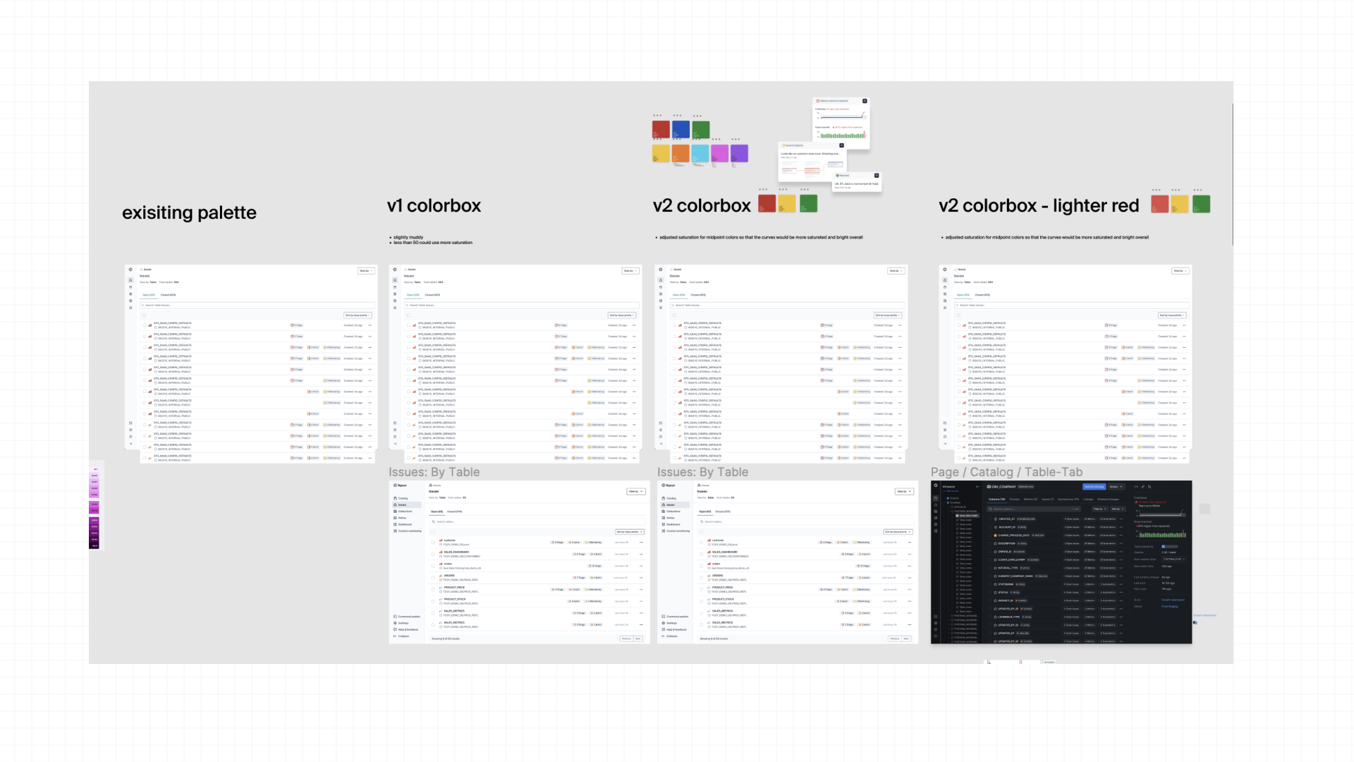
When I joined Bigeye, the company had recently gone through a rapid rebrand to accomodate an trademark request. The brand had all of the essentials: typography, visual hook, color palette, rough beginnings of an illustration style. But the colors fell flat - literally. They didn't meet WCAG accessibility guidelines, and more importantly felt disconnected from the now defined core of the brand. The Director of Design identified which colors Product Design would lift from the palette for the app UI, and I went about proposing a new, expanded, higher saturation, and more aligned palette.


One of the biggest project I've managed, designed, and collaborated on has been the evolution of the Bigeye web presence. Transforming the brand into an authentic representation of the Bigeye brand across all pages. Here is a sampling of pages: the homepage and product pages.


